Every year I take stock of the fonts I actually use versus the ones that just look good in a specimen book. These are my favorites for 2026. The ones I reach for when a project needs a specific tone or hierarchy. The ones that have proven themselves in real work.
This list moves roughly from serif headings down through sans body fonts. These are my go-to choices right now.
Heading serifs that project calm confidence
Rocaand Gelica are basically the same vibe. Calm but bold. They have this “we’re here for you” energy that works perfectly when you need to feel approachable but serious. Great for mission-driven organizations or brands that need to project strength without being intimidating.
Instrument Serif is completely different. It’s official, important, loud, pioneering. When you need a heading that commands attention and says “we’re doing something significant here,” this is the one.
Scotch Deck is the compressed variant of Instrument Serif. Same official, pioneering character but in a tighter package. Good for when horizontal space is limited but you still need that authoritative voice.
Miller Display brings journalistic credibility. Serious, official, authoritative. It’s the font equivalent of a well-researched article. Works beautifully for both headings and body text, which makes it unusually versatile.
The accent fonts
Ivyorais special. Any weight below bold exudes what I’d call silent luxury. Pure elegance and simplicity. But the real standout is the italic and oblique styles, which are exceptionally well-crafted. This is your sophistication font.
Norman Variable is my choice when I need elegant and enigmatic at the same time. Being a variable font gives you tremendous flexibility while keeping those refined sensibilities intact.
Sans workhorses
Instrument Sans might be my desert island font. People compare it to Helvetica, but dare I say it’s more perfect. Better balanced, more versatile. Smart, authoritative, legible, neutral. Works as body text, in headings, as accents. Just works everywhere.
Acuminhas that techy precision. Structured and versatile. Good when a project needs to feel contemporary and systematic without being cold.
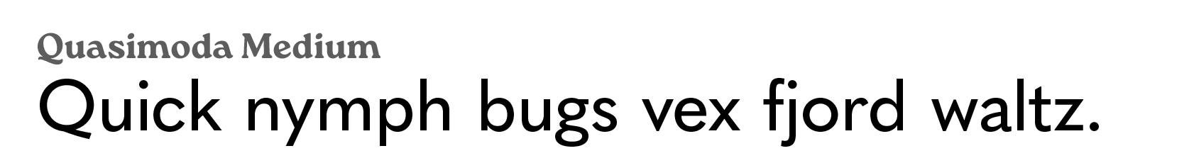
Quasimodais legible and versatile with a lot of variants to choose from. Some of the letter shapes remind me of Futura. There’s a geometric quality that adds character without hurting readability.
The reliable backups
Aktiv Grotesk is what I grab when I need techy, versatile, direct, and neutral with no frills. Beautiful sans that gets out of the way and lets the content speak.
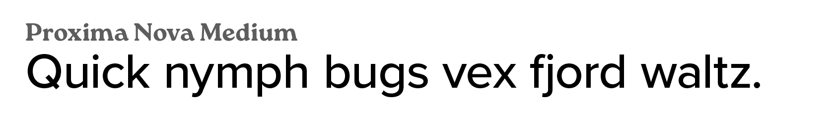
Proxima Nova rounds out the collection. It’s been around long enough to prove itself, and it comes in enough weights to handle pretty much any challenge. A solid, dependable choice.
The fonts we choose shape how our words land. These twelve have earned their place in my workflow. Whether you need pioneering confidence, journalistic authority, or quiet elegance, there’s something here worth considering.